Wednesday, 28 October 2015
Art of the commercial lens
Retail Fictions was published in conjunction with an exhibition of Bartholomew's work at the LA County Museum of Art in 1998. He was one of those interesting commercial photographers equally at home in the studio or working out doors. Starting in mid-thirties with a New York studio he created advertising work for major corporations like General Electric, Texaco, Eastman Kodak and Coca-Cola but also editorial shots for Harper's Bazaar, Ladies Home Journal, McCall's and Redbook.
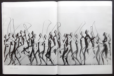
There are thirty-two photos in the book for Eastman Kodak from 1946 to 1952 (eight of these are in a two page fold-out) the company was one of his major clients because he had a knack of capturing groups of adolescence using a Kodak camera. Another of his specialities was using a stroboscopic lighting for multiple-exposure photos, there several of these for Playtex and a beautiful color one, over a spread, for Texaco.
The book is well produced with 108 plates, all of which involve people, I'm surprised there weren't a few still-life shots included. Tim Wride writes an interesting twenty-page essay (with illustrations) at the front of the book about Bartholomew's life and his work as a commercial photographer. What I liked about the book was seeing advertising photos without all the headlines and copy that art directors put on photos without too much consideration regarding the image. As all work is from the mid-thirties to the fifties it's a nostalgic look back to see how products were sold with photos.
Tuesday, 27 October 2015
Phoebe in troubleland 5/5
I first saw some of these strips in the Evergreen Review in the sixties. I had no idea they were reprinted until I came across this paperback while browsing in a second-hand bookshop sometime in the mid-eighties and discovered that there were additional adventures by O'Donoghue and Springer included, no doubt to bulk out the book. Phoebe seems to be sought out by a bunch of the world's ne'er-do-wells who inflict on her plenty of cruel and unusual punishments but luckily our heroine manages to escape each time, ready for a new adventure.
O'Donoghue's writing is just right with plenty of sixties cultural references. Episode ten Pain and ink, starts with the following:
MACAO Sprawling city of 2 million! Fleshpot of the enigmatic East!
MACAO Where every narrow, twisting alley leads to an unmarked grave and a man's shadow is seldom his own!
MACAO Where pestilence, famine and carnage are not disasters but a way of life!
MACAO Where a woman costs less than a cigarette and there is no word for virtue!
These statements are illustrated with four panels with Frank Springer's brilliant artwork. It's his artwork that I enjoy most about the book, he's a master at packing panels with detail and getting the most out of O'Donoghue's story line.
The prices for the title seem excessive to me so I think it's worth searching the net for a reasonably priced copy.
Saturday, 24 October 2015
A classic...now available for all
 |
| Additional book. |
 |
| Additional book. |
 |
| Additional book. |
 |
| Additional book. |
 | ||
| Addidional book. |
 |
| The Sutnar house in Prague. |
Most designers (of a certain age) have heard of Sutnar's visual design in action and some might have actually handled a copy. Whether young or old everyone has seen a reproduction or two from the book, probably a color page for the addo-x company or Carr's department store. With this remarkable facsimile you can all have your own copy now.
The book comes with a thirty-two page, same size booklet with an illustrated essay and extensive Sutnar biography (if you happen to buy a used copy of the book check with the seller that this extra is included, both publications come in a stiff clear plastic sleeve)
visual design in action is a rather extraordinary book which Sutnar paid to get printed because he couldn't convince any publisher to add it to their imprint. It seems to me that this isn't surprising, publishing in past decades and even now is still a rather conservative industry. How was he going to convince a company to publish a book set entirely in italic type, with no page numbers, requiring several different papers and thirteen inks, all of which has been copied precisely for this facsimile though it is printed by off-set litho rather than letterpress and I doubt a two hundred screen was used for the original black and white halftones.
The contents are A principles; B US information design process; C early modern design concepts. These three sections are further broken down into fifty-three spreads which have the reproductions of Sutnar's work and his text. Though the type is only seven point Ionic it's quite readable because of the generous leading. The spreads have either one long or two column blocks of type, no par indents either, these are indicated by a long dash. It's the four portfolio sections that look most impressive. Printed on matt stock: white and light ochre with various colored inks. This is where Sutnar probably spent his printing money by using separate inks rather than do it all as four-color sets. The corporate work for addo-x, Carr's store and other graphics in these portfolios just jump off the page.
visual design in action is a remarkable book full Sutnar's work and he seems to have turned his hand to a wide range of printed material and also book binding, exhibition design, glassware, ceramics and cutlery. This facsimile of the 1961 book is an excellent reminder of a hugely talented designer and Lars Muller should be congratulated for making it available for everyone.
Subscribe to:
Comments (Atom)


