Friday 28 November 2014

It's MARVELous

 The huge book comes with a handy cardboard carry case.


 Right there are several pages that show inked cover art.
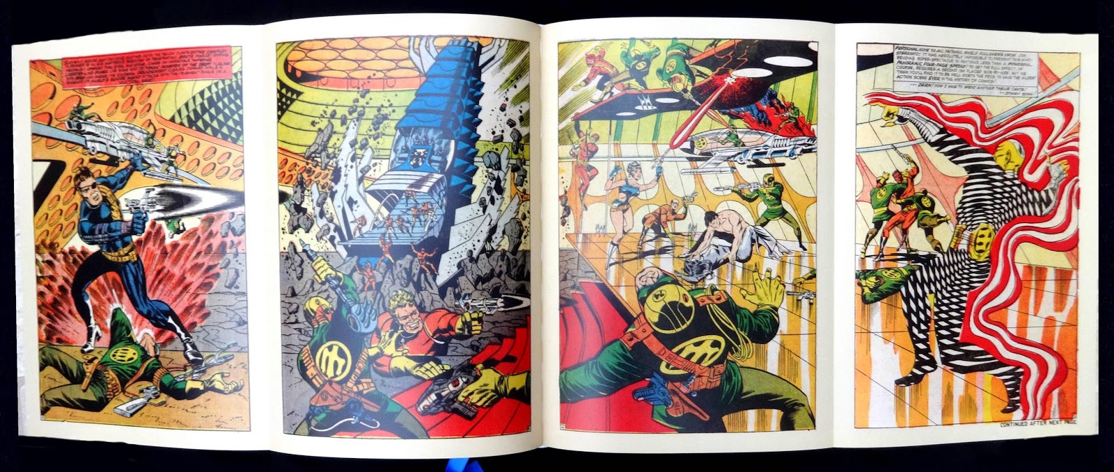
 Steranko fold-out.


 One of the metallic ink chapter openers.


Eight pages like this at the back of the book with biographies.
 The loose insert Marvel Timeline.

Another giant (and weighty) leap for comics history as Taschen delivers the goods on Marvel. The huge books follows the same format as the story of DC Comics Taschen published in 2010 though with a couple of differences: the five fold-out Timelines in the DC book are now presented as a loose insert printed both sides and folding out to fifty-five inches wide; there is no index, which I find sort of amazing in a title like this.

The editorial covers eight decades of Marvel and author Roy Thomas would seem the obvious choice to write about the company, he was an editor there from 1965 to 1980. The four chapters, each opening like the DC book with a spread wide bit of art printed on thick paper with reflective metallic ink, look at the origins of Martin Goodman and his Timely Comics of which Marvel was a subsidiary group of titles. Timely morphed into Atlas comics in 1951 which eventually, in the early sixties, became the Marvel line that carries on today and the book is right up to date, too, with the cover of Black Widow issue six from July this year.

A nice feature of the editorial are references to comic and media items through the decades and how they related to Marvel and their comic characters. I think the real strength of the book is the art, pages and pages of covers, spreads, individual frames and several examples of cover art (blown up big) as inked but before the color was added. A two-page foldout of Steranko's spread from Strange tales 167 is also included.

The book's production is, as the DC title, first-class. Beautifully printed and bound with all the images getting deep comprehensive captions, eight pages at the back have biogs of several dozen writers and artists who were the real masters of Marvel. Taschen have thoughtfully provided a blue silk bookmark.

Overall a feast for the eyes but what will the next book be about? I'm putting my money on EC comics getting the Taschen treatment, in three or four years time.

Friday 21 November 2014

Bright metal mastery

Two excellent books about Georg Jensen: Jewelry was published by Yale in 2005 (ISBN 0300107064Georg Jensen Silver and design was published in 2004 to celebrate the a hundred years of the company.  I found it a first class history of the company, well illustrated and designed.  The publisher was the Danish Gads Forlag (ISBN 8712041300) copies can be found on the net and the Jensen shops sell copies.


A very handsomely produced coffee-table book about the mastery of the Georg Jensen silversmithy. It is though basically a visual celebration and not a history in words. The large size allows selected works from seven designers to be shown with huge enlargements. They are: Jensen; Johan Rohde; Harald Nielsen; Sigvard Bernadotte; Henning Koppel; Vivianna Torun Bulow-Hube; Vernon Panton and a few others in pages near the back of the book in a chapter called Collaboration.


I've been buying Jensen silver for years (as my parents did before me) and I love Koppel's designs, the work shown in his chapter was particularly interesting to me though I thought it was a pity some of his watches aren't shown or the stunning Wave bowl.

A really nice feature is the use of drawings from the Jensen archive showing various jewelery and silverware and a photo of the real thing. Other color photos, in close-up, bring out the Jensen craftsmanship. It's worth saying that most of the photos in the book are not pin-sharp studio ones but what might be called artistic shots, always tastefully done and I think this makes them come alive and show off character of the work.

Despite the excellence of the photography, paper and printing the book has a couple of editorial flaws. The headings and text (fortunately not too much of this) are printed in silver which makes it hard to read in the wrong light, captions are on whole page photos, usually in white but these pages frequently face pages with a photo and generous margins which would easily take the captions.

The book is really a snap-shot to show you how wonderful Jensen silver looks. A comprehensive overview of jewelry can be found in Georg Jensen Jewelry (Published in Association with the Bard Graduate Centre for Studies in the Decorative Arts, Design and Culture) and the only worthwhile history is Georg Jensen: Silver and Design . This was published in 2004 to celebrate a hundred years of the company, beautifully designed with excellent color photos, hard to find on the net but I think all the Jensen shops still sell copies. Avoid the really dreadful looking 1997 Schiffer book (and the reprint).
.


Thursday 20 November 2014

Take it black


Color expert Katrin Trautwin has written an intriguing book (actually two sections in a slipcase) about black and color, it's primarily aimed at architects and interior designers. She writes about the different blacks and in particular Ivory Black made from charred animal bones. Because this is expensive the commercial mixing industry uses carbon black for paints, printing inks, plastics et cetera but this can't offer a really solid velvety black.

The nine essays and lists in the book analyse color used by architects, especially Le Corbusier who, with Amedee Ozenfant in the 1920s, used their theories for colors inside Modernist houses. They thought specific pigment mixtures, always natural ones, could influence how space is perceived. Color could help in four functional ways: Atmospheric; Constructive; Dynamic; Decorative. The book quotes the Decorative function using glazes, patterned wallpapers, mural and tapestries as helping to modify the appearances of surfaces within three-dimensional structures.

I mentioned that the book is in two parts. One has the essays (in English and German) and the other has twenty-four color samples which fit inside the second book's pocket. These samples, roughly 10.75 by 9 inches, are very impressive to look at and feel. To get really solid, deep color they have been screen printed on white card. There are sixteen shades of black only using Ivory Black for printing. Sheet eight is just called Black, a lovely solid, velvety color, the other fifteen are equally strong and powerful but have tinges of red, blue, purple, green and brown yet compared to the other color sample sheets anyone would say they are all black. Ultramarine blue, Champagne white, Deep red and Gold bronze plus four greys make up the eight other sheets in the set. Incidentally because these sample sheets are screened with rich, solid colors they need to be handled carefully because they will show up any marks made on the surface.

The first book has some interesting color theories and their practical uses but it was the richness of the screen-printed samples in the second book that made it all come alive for me.

Tuesday 18 November 2014

Blues of note


 Right top Rudy Van Gelder.


An excellent addition to Richard Havers first book on Verve and Norman Grantz. This Blue Note title visually follows the same format with plenty of artist photos, LP covers and printed ephemera from the label's past decades. The text, though, follows a different style from the Verve book which interspersed the history of the label with spreads devoted to the performers. In these Blue Note pages seventy-five albums are given a spread or more with a large graphic of the cover, performers, tracks and a few hundred words of background about the album. The first record spread is frequently followed by a page or two with addition photos and related material about the artist.

The first ninety-nine pages cover Alfred Lion's early years and his arrival in New York during 1936. He started Blue Note in 1939 with Meade Lux Lewis and Albert Ammons as the first stars of the label. WW2 slowed recording activity until 1944 when Lion (then thirty-four) started to record a more contemporary sound with Ike Quebec, who became the A&R man for the label. The fifties were the start of Blue Note's golden years and in particular 1953 when Rudy Van Gelder began to record the label's musicians.

I've always thought that part of the success of Blue Note was the sound Van Gelder created in his studio. The tracks always seemed particularly loud with tremendous presence, perfectly in keeping with the feel of East Coast jazz at the time. Page eighty-four says that he recorded the music with high decibels, far more than other sound engineers (in recent years Blue Note CD re-issues have been marketed as 'Rudy Van Gelder masters'). Another original facet of the label was the creative sleeve design by Reid Miles, either using the stunning photos by Francis Wolff taken in the windowless Van Gelder studio or just using type only. Type with maybe with a simple graphic was something other jazz labels picked up on to keep their covers distinctive in a crowded LP market.

The label changed in 1966 when it was bought by Liberty Records and in 1967 Alfred Lion retired. On page 197 he is quoted as saying 'I couldn't communicate with these people at Liberty, I do things my way and suddenly there were too many people and there were all these rules and procedures'. In fact jazz was slowly changing and Blue Note, to my mind, became just another record company releasing LPs with a much broader interpretation of jazz with vocalists a significant part of their artist roster. The book follows these changes and it's interesting to see the covers from the seventies onwards which have completely lost their Reid Miles style. The seventy-five records which the book's editorial is based on go up to 2103 with a release from singer Gregory Porter.

Alfred Lion, Rudy Van Gelder, Reid Miles and Francis Wolff were Blue Note to me in the mid-fifties to the mid-sixties when I was buying their records (now bought all over again with Michael Cuscuna CD re-issues). The book is a wonderful memory jogger for me, as was the Verve one, and it will fascinate others of a certain age. BL fans should also check out the two books of Francis Wolff photos and the lovely Graham Marsh/Glyn Callingham paperback of several hundred LP covers.

* I wonder if Richard Havers will write more books on jazz labels run by individuals: Pacific Jazz with Richard Bock; Contemporary Records and Lester Koenig would seem the next obvious choice.