Wednesday 26 January 2022

Build your own, brick by brick (5/5)


The book came out in 2015 which is you can pick up a copy really cheaply. The essence of the title is ten buildings with step-by-step visual instructions, just like the real LEGO instructions. There are a couple of other instructions to show a load-bearing structure and a curtain-wall building that could be part of your own building. Of the ten models, I loved the Art Deco movie theater.

For best results, I think you should have the LEGO Architecture Studio box though I don't think the company sells this anymore. All the how-to-make models are shown as mono photos and the Architectural box only has white pieces (but with clear acrylic window pieces).

The book is also a sort of primer about architecture but very superficial I thought the color photos of the building were rather well chosen and they are all captioned. Many of the buildings are also LEGO models made by professionals and using thousands of pieces.

I think it's well worth getting if you can find a cheap, good copy, say, less than eight dollars.


Wednesday 5 January 2022

The frog never looked more interesting (5/5)


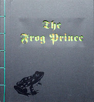
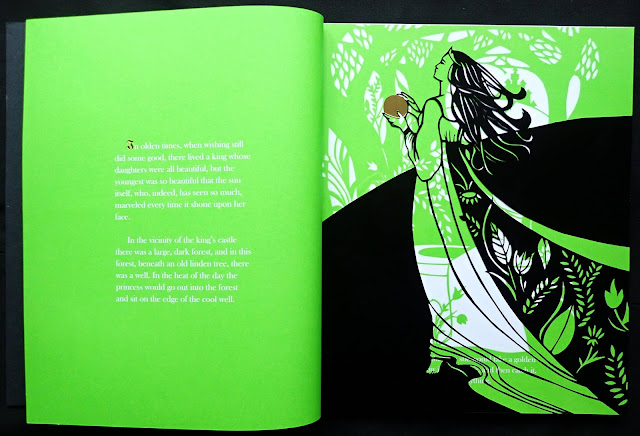
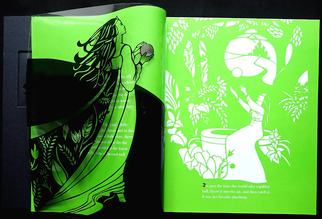
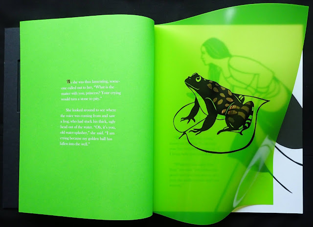
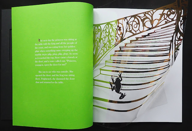
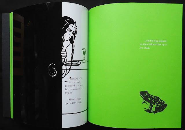
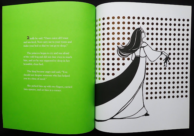
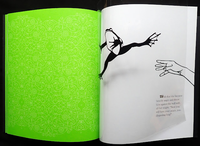
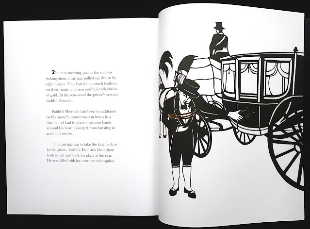
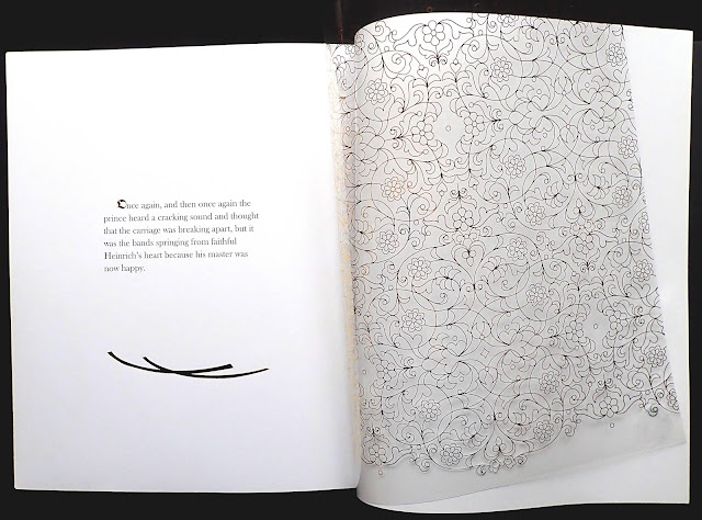
Illustrator Sybille Schenker has created another wonderful graphic storybook. This is her third Brothers Grimm book and uses plastic pages with a gold, silver and black ink with other paper pages printed with black and gold. Like the other books, the title is laser cut out of the cover (obviously fragile so the book has a clear plastic jacket).

It's the book's production that makes the story come alive for me. The illustrations printed on the plastic pages and gold type on the paper pages give this traditional story a contemporary feel. Graphic designers will love it. 

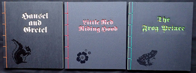
Schenker's previous Brothers Grimm books include Hansel and Gretel (2011) printed with some pages using tracing paper, Little Red Riding Hood (2014) used laser cut shapes on several pages. Her three books are a joy to look through.

Chock full of designer typographic whimsy (1/5)


The book is volume one, published in 1996 and probably future books have the same contents of very little merit. The samples shown are equally from design colleges or professionals, I found it hard to tell the difference and neither groups seem to have taken on board that type conveys a message and needs to be read to put that message across.

So much of the contents, at first sight, give no indication of what they are. A book jacket has certain characteristics that say this is a book jacket, likewise with a poster, CD cover, Annual Report, magazine cover and editorial et cetera. Luckily every piece has a caption that includes 'Work description', otherwise I found it impossible to tell with all this work.

Nearly all the pieces reflect designer whimsy, that is, playing around with display type and columns of text to please the designer rather than thinking of the reader. It looks like design education, at least as far as the contents of this book are concerned, isn't bothered about the reader. 

Thankfully I picked my copy, recently, for next to nothing. I was drawn in by the title and thought it might be interesting, sadly not.