




I've been waiting a long, long time for a book like this. In most of the books I have on Deco (or Streamline or Moderne) there are always one or two of these postcards included, they were, in many cases, the only visual surviving examples of what the buildings looked like. Patricia Bayer has done us all a favor with this delightful book of 264 postcards.
Perhaps the Art Deco title is slightly misleading because as I looked through the pages Streamline seemed much more appropriate. So many of the buildings have those wonderful curves, right angles, glass blocks and occasional porthole windows that were part of any proper Streamline building. I always thought Arrasmith's stunning Greyhound terminals were the ultimate examples of the style.
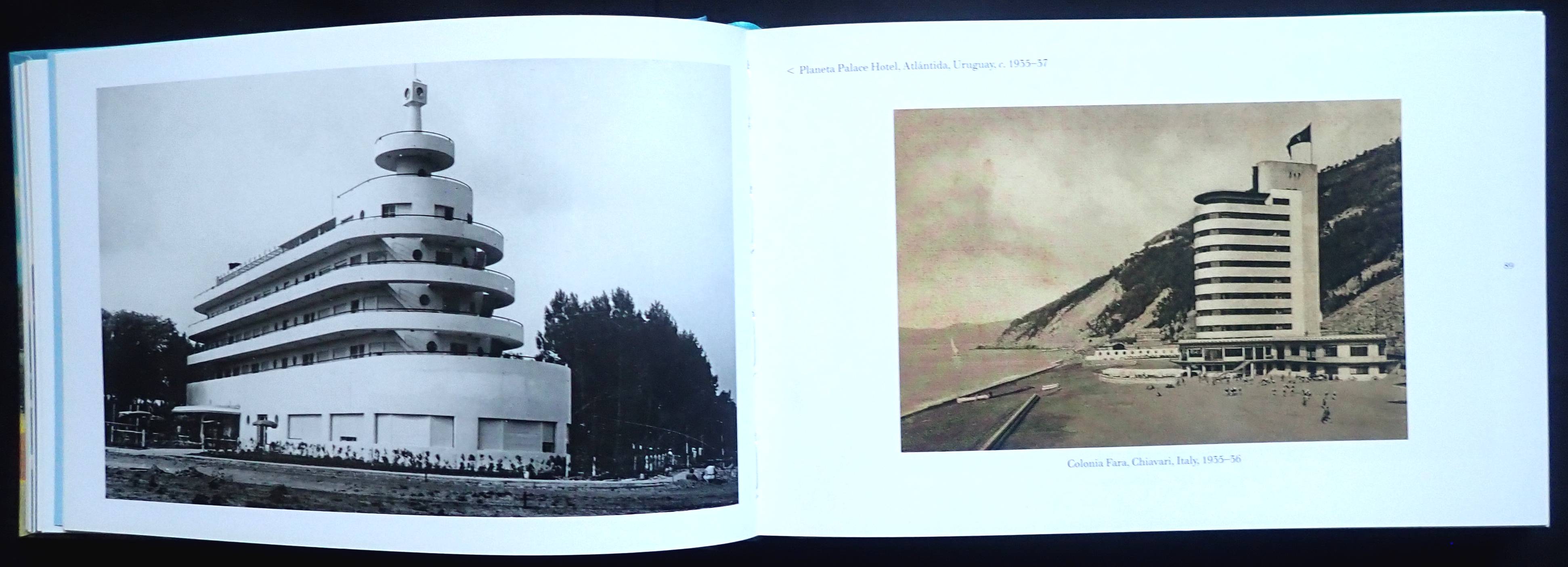
A really nice feature in the book are postcards of Streamline buildings in parts of the world where you really wouldn't expect to see them: Rio de Janeiro, Brazil; Yokohama, Japan; Pula, now Croatia; Kharkov, Ukraine; Benalla, Australia; Casablanca, Morocco; Copenhagen, Denmark; Caracas, Venezuela and several in Britain. Page eighty-nine has a postcard of the remarkable Italian Colonia Fara beachfront building designed in 1935 and still standing, pure streamline and looking like it was transported from Los Angeles.
The author covers so much with this postcard selection, exterior and interiors of buildings, motels, transport, commerce and industry, world's fairs, it's all here. Near the back of the book, there are eight pages of perforated cards ready to mail (though far better, I think, to frame them). At the very back are thirty pages of captions for all the cards, full of fascinating detail about the buildings torn down over the years.
This is a gem of a book for those who love the Deco/Streamline/Moderne style. Surely there must be enough of these postcards for a volume two!


