Friday, 30 May 2025

How to showcase a company 5/5


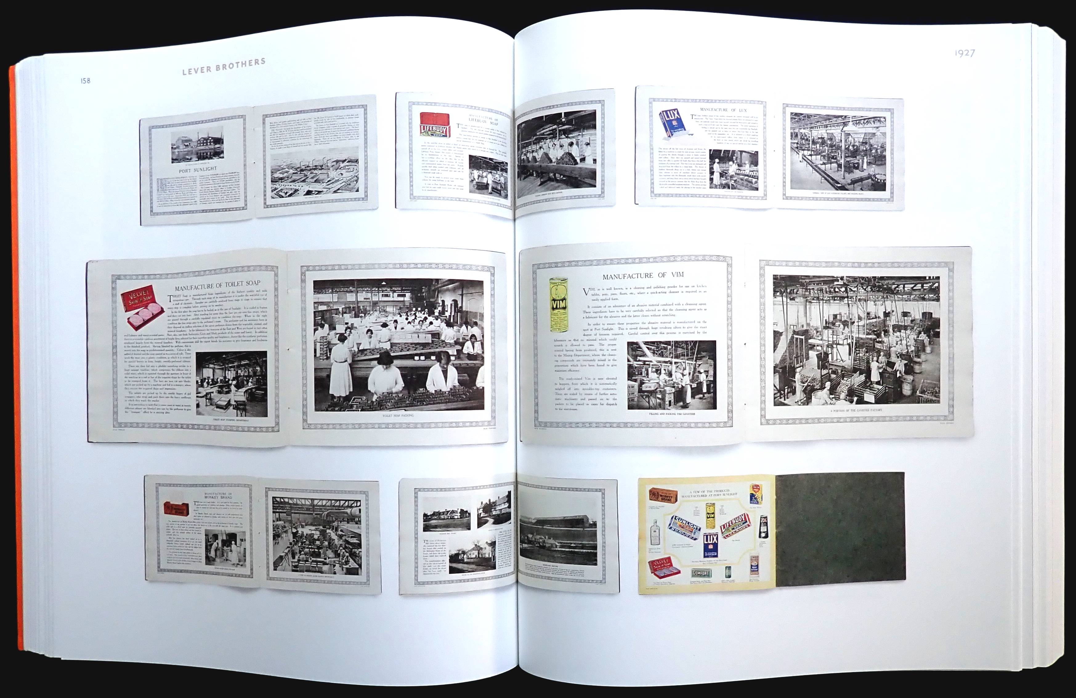
The title is an excellent addition to the photobook genre and who would have thought that such a rich collection of company printed matter from 1890 to 1987 was available. Thanks to author Bart Sorgedrager who wisely collected company photobooks and 175 are shown on these pages. 

These are, of course, basically company PR but because cost wasn't a primary consideration for publication there are some very extravagant productions: the French Geo Foucault & Schweitzer, a meat company, in the 1920s, published a 312-page paperback, the Swiss fabric company Heberlein took 160 pages to show off their wares, in 1959 the Dutch Plem electronic company produced 146-page hardback. These are the exceptions because most of the publications are less than fifty pages and those published before 1940 usually used black and white photos but frequently with a second color.

I was surprised to come across publications that went the extra mile, for example, five companies published 3D titles (including the glasses). Dutch chocolate company Van Nelle issued, in 1931, a shot of their factory as a hundred-piece jigsaw, as did Lips, also Dutch, with an aerial factory shot in a 120-piece jigsaw. Karl Krause, a German company celebrated the 100,000 production of bookbinding machinery with a folder containing sixteen postcards showing the interior of their factories.

These company publications are full of photos, usually by unknown photographers but famous names do show up. Margaret Bourke-White took the shots for the seventy-four-page book titled Newsprint for International Paper in 1939, Lee Friedlander worked for Cray Computers in 1987. Designer/photographer Piet Zwart was responsible for several publications shown in the book.

Overall I thought was a fascinating look at the relatively obscure company photobook, obscure because none of these titles were sold to the public. The 506 pages are nicely designed though I would have preferred less white page space and bigger spreads from the books. Manfred Heiting's photobook series published by Steidl (Soviet, Japanese, Dutch, Czech & Slovak) shows how it can be done and still look beautifully designed.

US
UK


Thursday, 29 May 2025

Ruined ruins 2/5


Henk Van Rensbergen takes very impressive photos as you can see in this book, unfortunately, it's not much bigger than a pc notebook so all of the fascinating detail that photos of ruins reveal is wasted on these small pages. The Belgium publisher of this book has other titles that are a more conventional size to properly show off Rensbergen's work. 

It was good for instant creativity 4/5


Who remembers rubdown Letraset, or even wet screen Letraset? This 341-page book is a fond visual look back at the product that made every user a typographer. The original 1959 idea was (fortunately) short-lived with a wooden frame holding a gauze that used a wet transfer system to create a line of type. The book has several pages about this and the various typefaces available.

Vastly superior to the wet version was the dry rubdown type from 1961 and Letraset took off, around the world, too. There are pages and pages showing the sheets, minus a few letters of course, non-type sheets of arrows, symbols, clipart and a showing of the various Letraset products like storage boxes, spray coatings, coloured tape,  Pantone colour sheets and catalogues (apparently still selling well with online). One of the products I really liked was the sheets of Latin text making it possible to create quite credible-looking dummies for a leaflet, brochure or maybe magazine spreads.

A really smart move the company made was to introduce Letragraphica, issuing new typefaces on a subscription basis before they could be bought over the counter. The faces were either created by Letraset designers or licenced by international type companies. The arrival of the pc more or less killed off rubdown type though there is a small segment of the idea still available in craft shops.

The book is a lovely look back that will be pure nostalgia for designers of a certain age.


US
UK

Friday, 2 May 2025

A final and stunning look back 5/5


In 2009 I bought the Steidl published 'Bruce Davidson Outside inside', a three-book boxed set with 942 pages and 834 photos. It's a quite remarkable collection of this photographer's reportage work. Now in his nineties, Davidson has returned to his archives to select photos for 'The way back', a sort of supplement to 'Outside inside.'

The 128 photos are a selection from 1957 to 1992, though he was working commercially before '57. There are sixteen main selections (with three photos or more) and with others just one or two shots. Maybe his most well known work was documenting East 100th Street, New York between 1966 and 1968. Here are sixteen photos, including eight in color that were not in the ninety-one in 'Outside inside.'

Almost all the pictures includes people, one of Davidson's work characteristics, where he photographs ordinary people in their normal environment, whether Welsh coal miners or customers in a burger bar. On page ninety-five one photo stopped me, taken in 1963, it shows a construction worker jumping from a girder to a much smaller one and I wondered if Cartier-Bresson's famous 'Decisive moment' from 1932 had flashed across Davidson's mind. Two different places but both men are in near identical movement.

Steidl have produced the near perfect photobook, one photo a page (with a 175 screen) and generous margins. The paper is a silky matt art making it a pleasure to turn the pages but slightly annoying is putting all the one line captions on a back page so the reader has to do a lot of flipping. 

US
UK