Friday, 4 August 2023

The Word: with clarity and simple elegance (5/5)


For a book that has influenced so many people, I'm amazed at how poor various editions look and how perfect this Bible is. The story starts in 1969 with Field Enterprises, in Chicago, asking designer Bradbury Thompson to think about a complete visual overhaul of the existing standard Bible. Unfortunately, the project was abandoned in 1972 because of economic circumstances, so Thompson approached Washburn College who provided backing and a limited-edition three-volume set came out in 1977. The success of that title convinced Oxford Uni Press to print this one-volume edition.in 1980.

Thompson's brilliant idea for this King James text Bible was to discard the traditional oblong two-column setting per page for a much simpler two columns with a varying line length so the text was ragged on the right. This avoided hyphenations at the end of a line and allowed even spacing between the words. Because the text is now in phrase-length lines, the columns vary in depth, though only by five lines or less, so that the top of each one starts with a new verse. The chapter and verse numbers are set in the margin to the left of each column, which avoids having these dropped into the text and hindering the narrative flow. I found this annoyance so common in many Bibles I looked at to compare with this Washburn edition. Because of the large page size, the type is a generous fourteen-point (called Sabon Antiqua) with a minimum of words in capitals and no italics. No quotation marks for speech either, because 'He said' or 'Saying' are always on separate lines before the quotation.

To break up all the pages of text, each book in the Old and New Testament starts with one of sixty-six religious paintings by fifty-five artists over seventeen centuries. These have short captions and biblical text that provided inspiration to the painters. European-born artist Josef Albers provides three simple but beautiful linear abstracts at the start of the three sections of this edition. The front pages have an introduction explaining the thinking behind this new typographic interpretation of the Bible.

Bradbury Thompson, who died in 1995, was a great print designer, probably best known for his work for Westvaco paper company and their magazine 'Inspiration for Printers' but he also designed stamps for the USPS, magazines (Mademoiselle for example) and books but I think it is his remarkable design of this Bible that he should be remembered for. I think he achieved something special here, a book where it is a joy to turn the pages and see an honesty of presentation that the words deserve. A design masterpiece!

Saturday, 29 July 2023

The classic revealed (4/5)


Fans of this amazing series can give their eyes a rest from watching the DVDs and try a bit of page-turning instead. It's a large size book with a breakdown of all five season's episodes, interviews with the principal characters and production staff plus a few hundred photos and assorted bits of ephemera from the episodes.

Four stars because I was disappointed with the rather bland look of the book. The photos all have a rather soft look and the page layout isn't very inspiring. This became apparent when the book is compared to that other fabulous HBO series The Sopranos. Their hardback book (ISBN 978-1933821184) had excellent studio portraits of the leads, the usual episode listing and a much more creative page design that made the book worth reading and looking at.

Friday, 28 July 2023

Dutch photobooks (5/5)


The latest superb  Steidl/Heiting photobook compilation (the previous English titles include the Soviet Union, Czech/Slovak and Japan) examines 615 publications.  Heiting makes an interesting point in his illustrated introduction, he prefers photo publications instead of photobooks. The latter implies photographic monographs with an art connection, the Dutch books looked at are those that have significant photo content in their editorial format.

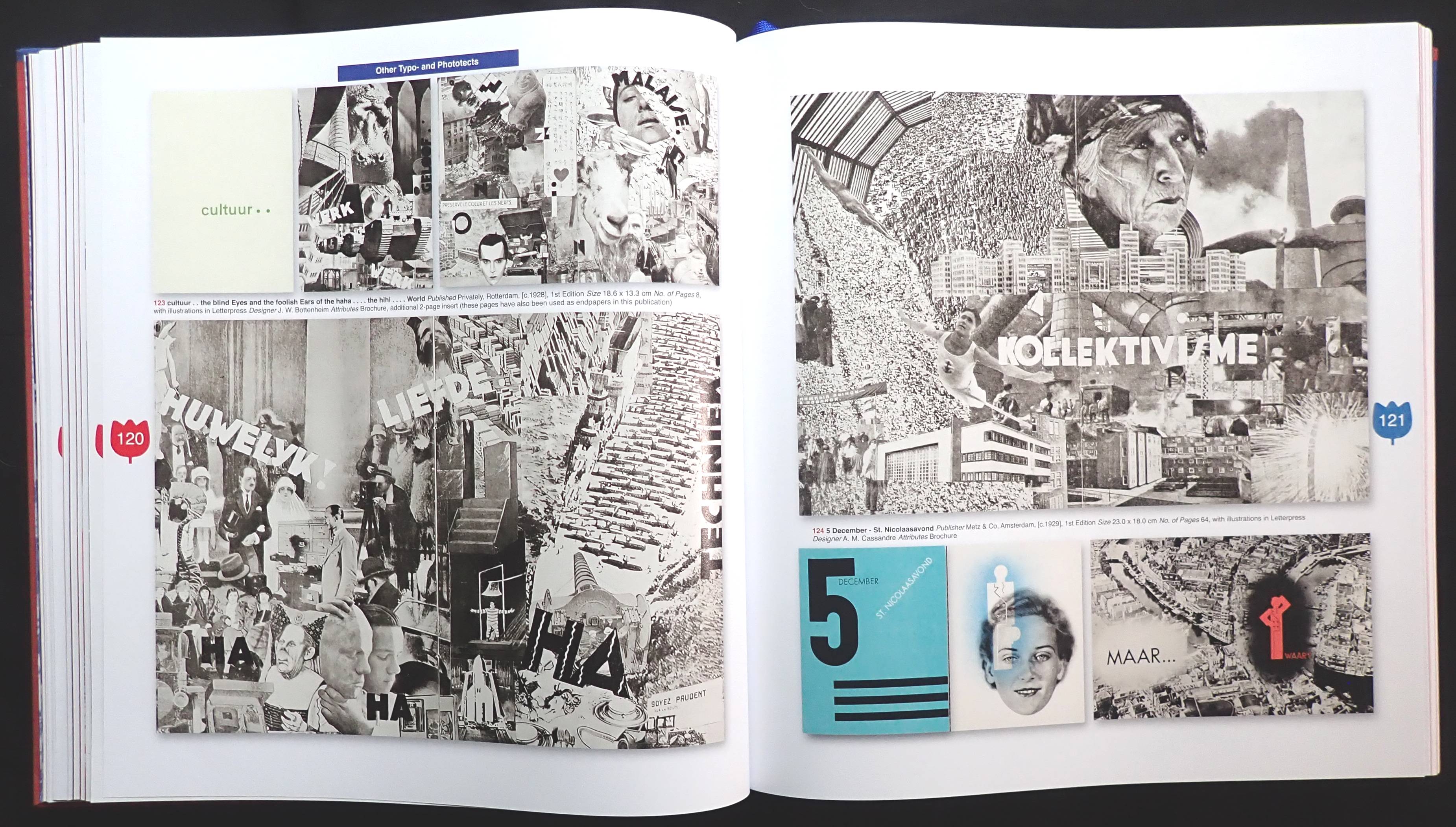
The eighteen chapters, by six writers, analyze publications from 1918, though Matie Boom sets the scene with sixteen from 1889 onwards. The Typo and phototects chapter shows pages from twenty-three books revealing designer Piet Zwart's brilliant use of typography and photos, the rest of the chapter, with books and brochures published before 1940 and by other designers shows some excellent page designs that still look fresh today.

There is a chapter devoted to the printer Meijer Wormerveer run by Dirk Meijer who, rather uniquely, promoted his company as a printer of corporate photobooks for industry. With some examples he was also the publisher using the design, photographic and writing talents of the GKF (a Dutch association of creative folk) the pages shown are from the fifties and sixties revealing strong images of Dutch industry.

Famous Dutch photographer Ed van der Elsken gets a chapter to himself with fifty-six books of his work including the 1956 Sweet life which is probably one of the first photo novels (and quite expensive on the used book market). Other titles reveal his travels around the world as a photojournalist.

This is a big, chunky book (like Heiting's other titles) with 540 pages and over a thousand illustrations from the 615 publications examined. Nicely they all have a slight drop shadow and  printed on a good matt art paper with a 175 screen. The author also designed it and cleverly used photos over a whole page or spread to break up the hundreds of smaller images.

The overall impression I have is that the Dutch, in a rather small country, created some remarkable publications that relied on photos to tell the nation's story.

UK