Sunday, 7 December 2014
Design, not just shape!
A timely publication to celebrate Max Bill's travelling 1949 Die gute Form exhibition. It's important enough to be mentioned in histories of twentieth century design even though it was made up of just eighty display panels with 240 black and white photos. Claude Lichtenstein in his front of book essay says that Bill had just a few weeks to organise the display and choose the photos to illustrate his view of good design. There were four sections: Design demonstrating function; Design in architecture; Design in the home; Design in daily life. The last section was probably easy to apply in neutral Switzerland but in war-torn Europe, even in 1949, good design in daily life was in short supply.
I thought the way the book reveals the exhibition was quite clever. The panels have been reduced to fit exactly the page size and a light coloured panel added underneath for the English translation. The arrangement of photos and text on each panel was incredibly simple, usually one top left, one bottom left and one middle right. Each photo had twenty words or so as a caption. Bill's floor design was to always have the panels in a curving line and there are some plans in the book to show the way he achieved this in various locations.
The photos to illustrate the four sections are quite broad in scope. In the architectural section there's the Rockefeller Center and Frank Lloyd Wright's Johnson Building in Racine, Wisconsin. Design demonstrating function features, rather oddly, four electricity pylons. The home section is full of furniture, tableware, appliances, kitchen and bathroom fittings, clothing and footwear.
Bill took the view that an object should be judged on more than just its appearance but also in how well it functioned in practical use. He was critical of Swiss Werkbund (the exhibition organisers) members who didn't share his views, they in return were annoyed that he didn't have more Swiss design included. This is probably the reason why the exhibition has achieved its status over the decades, the 240 photos displayed well designed objects that had a timeless quality about them.
The book is a first-class production, the upright shape (created by the exhibition panel dimensions) works well. There are seven essays, Chronology, Biography, photos and plans in the 160 pages. I'm not quite sure of the relevance of having the essays after the exhibition panel pages all in lower-case but Bill seemed to favour this style with his name and work.
Friday, 28 November 2014
It's MARVELous
The huge book comes with a handy cardboard carry case.
Right there are several pages that show inked cover art.
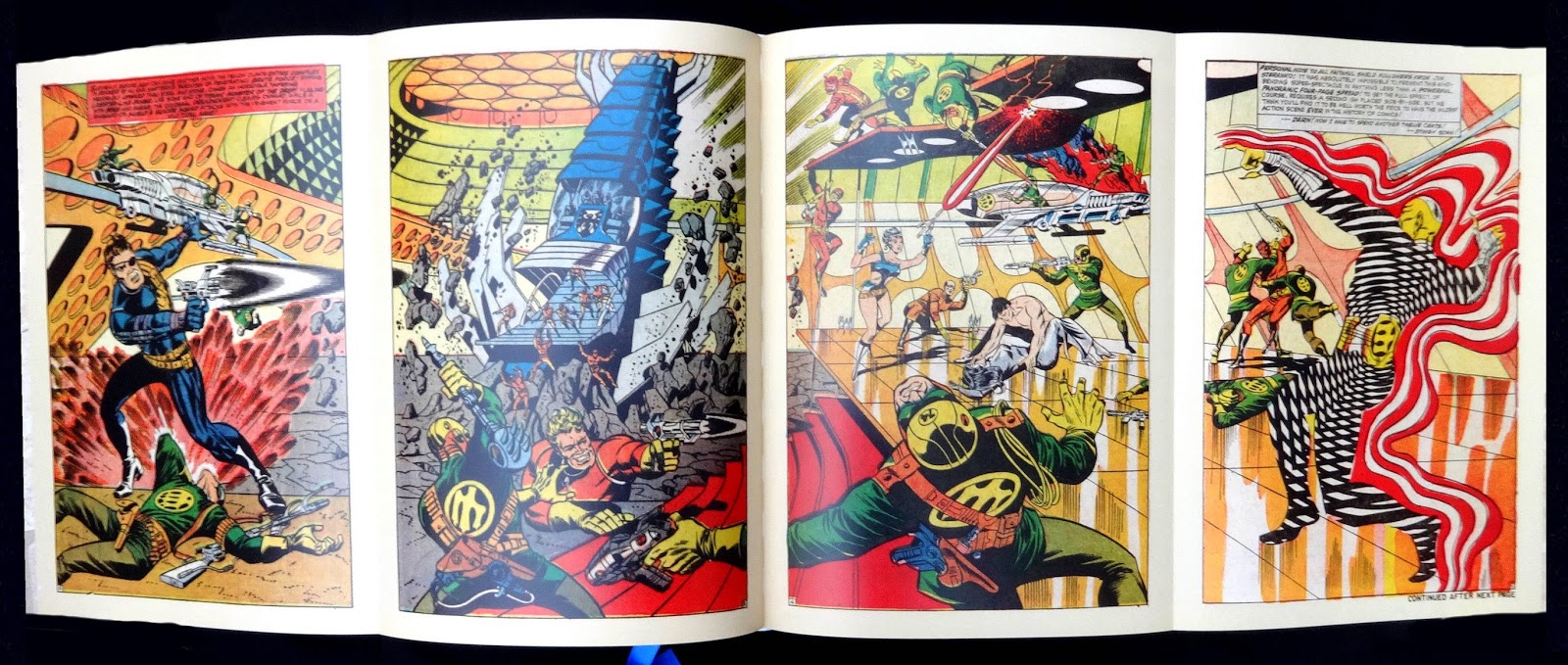
Steranko fold-out.
One of the metallic ink chapter openers.
| Eight pages like this at the back of the book with biographies. |
The loose insert Marvel Timeline.
Another giant (and weighty) leap for comics history as Taschen delivers the goods on Marvel. The huge books follows the same format as the story of DC Comics Taschen published in 2010 though with a couple of differences: the five fold-out Timelines in the DC book are now presented as a loose insert printed both sides and folding out to fifty-five inches wide; there is no index, which I find sort of amazing in a title like this.
The editorial covers eight decades of Marvel and author Roy Thomas would seem the obvious choice to write about the company, he was an editor there from 1965 to 1980. The four chapters, each opening like the DC book with a spread wide bit of art printed on thick paper with reflective metallic ink, look at the origins of Martin Goodman and his Timely Comics of which Marvel was a subsidiary group of titles. Timely morphed into Atlas comics in 1951 which eventually, in the early sixties, became the Marvel line that carries on today and the book is right up to date, too, with the cover of Black Widow issue six from July this year.
A nice feature of the editorial are references to comic and media items through the decades and how they related to Marvel and their comic characters. I think the real strength of the book is the art, pages and pages of covers, spreads, individual frames and several examples of cover art (blown up big) as inked but before the color was added. A two-page foldout of Steranko's spread from Strange tales 167 is also included.
The book's production is, as the DC title, first-class. Beautifully printed and bound with all the images getting deep comprehensive captions, eight pages at the back have biogs of several dozen writers and artists who were the real masters of Marvel. Taschen have thoughtfully provided a blue silk bookmark.
Overall a feast for the eyes but what will the next book be about? I'm putting my money on EC comics getting the Taschen treatment, in three or four years time.
Friday, 21 November 2014
Bright metal mastery
A very handsomely produced coffee-table book about the mastery of the Georg Jensen silversmithy. It is though basically a visual celebration and not a history in words. The large size allows selected works from seven designers to be shown with huge enlargements. They are: Jensen; Johan Rohde; Harald Nielsen; Sigvard Bernadotte; Henning Koppel; Vivianna Torun Bulow-Hube; Vernon Panton and a few others in pages near the back of the book in a chapter called Collaboration.
I've been buying Jensen silver for years (as my parents did before me) and I love Koppel's designs, the work shown in his chapter was particularly interesting to me though I thought it was a pity some of his watches aren't shown or the stunning Wave bowl.
A really nice feature is the use of drawings from the Jensen archive showing various jewelery and silverware and a photo of the real thing. Other color photos, in close-up, bring out the Jensen craftsmanship. It's worth saying that most of the photos in the book are not pin-sharp studio ones but what might be called artistic shots, always tastefully done and I think this makes them come alive and show off character of the work.
Despite the excellence of the photography, paper and printing the book has a couple of editorial flaws. The headings and text (fortunately not too much of this) are printed in silver which makes it hard to read in the wrong light, captions are on whole page photos, usually in white but these pages frequently face pages with a photo and generous margins which would easily take the captions.
The book is really a snap-shot to show you how wonderful Jensen silver looks. A comprehensive overview of jewelry can be found in Georg Jensen Jewelry (Published in Association with the Bard Graduate Centre for Studies in the Decorative Arts, Design and Culture) and the only worthwhile history is Georg Jensen: Silver and Design . This was published in 2004 to celebrate a hundred years of the company, beautifully designed with excellent color photos, hard to find on the net but I think all the Jensen shops still sell copies. Avoid the really dreadful looking 1997 Schiffer book (and the reprint).
.
Subscribe to:
Posts (Atom)