


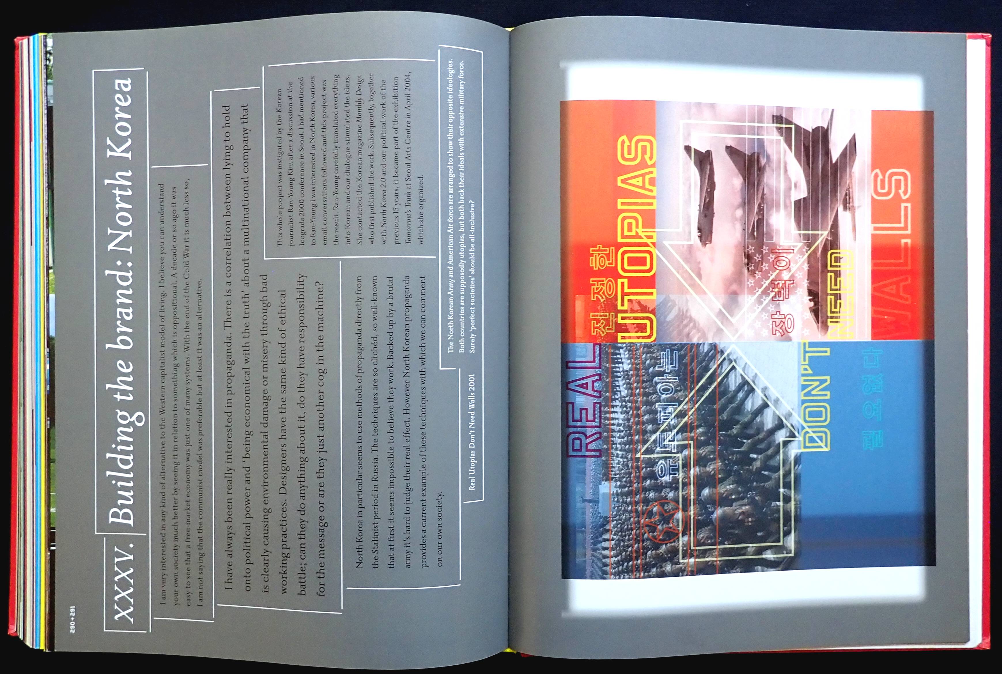


This is really a 230-page book of nicely printed (with a 175 screen) eye candy. Published in 2007 and designed a bit before that so now the pages look quite dated. From the Contents page onwards it's a visual explosion on every spread.
Any book on design will be heavy on typography, chapter XXII (who uses Latin in this digital age) has a Chronology of Fonts over thirty-two pages and printed on a separate paper to the rest of the book. An impressive selection of mostly unreadable faces is revealed as display alphabets and also set in definitely unreadable text settings. I wonder if the use of these faces could be classed as visual pollution?
No part of the book has been left untouched by design. For example, the page numbers start out as centered on the bottom margin, then as 22&23 on the left-hand side of spreads, from 43 changing to individual numbers per page on the left and right, centered again on the page margin from 68 (ten pages before this have no numbers). The chapter on Damian Hirst changes to 092+093 top left of each spread. Chapter XVII reverts to 112 and 113 on a spread. 236 to 246 have no numbers. This is tedious nonsense devoted just to the page numbers.
I was recently reading another designer's 'bible', The Vignelli Canon (ISBN 978-3037782255) published in 2010 and in just 112 pages world-famous designer Massimo Vignelli packs in a ton of design theory and practical information and all the page numbers are in the same place, too. Vignelli makes an interesting point about types, he uses a basic six and no more than twelve standard faces that have been around for decades.
The BB reflects British popular graphic design at the turn of this century but looked so dated now.
No comments:
Post a Comment